
Welcome back to the CSG blog! I know I'm a day late with the post, but better late than never and I really wanted to make sure that I got this blog post right.
As we move into the autumn, I personally start to think of cozy sweaters, thick scarves, and warm coffee cups in my hands as I'm sure most of you do. It gets me thinking of all the fall colours that start to appear - the most beautiful, vibrant colours of red, orange, green and yellow. How does this tie into crochet or knitting? Well, there's one specific step in the planning phase that frequently causes even the most seasoned crafters to freeze in their tracks. That step is choosing the colours.
You have likely experienced this, where you find the perfect pattern, do all the calculations and then you stop at where ever you buy your yarn at. Suddenly, you are confronted by a wall of thousands of skeins, spanning every conceivable shade, tint, and hue. The sheer volume of choices can be entirely overwhelming. You might pick up a beautiful skein of hand-dyed variegated yarn, but then struggle to find a coordinating solid colour to match it. You might worry that the three colours you selected for a striped baby blanket will clash horribly once they are stitched together.
Sometimes people have a natural eye for what looks good together, and sometimes people don't! If you do or don't, sometimes we have to look past our basic intuition and dive into the fascinating world of colour theory. Understanding the mechanics of how colours interact with one another will transform the way you approach your yarn stash. In this comprehensive guide, we will break down the essential rules of colour theory, explore how to apply these concepts to your yarn choices, and share practical techniques for ensuring your finished handmade items look absolutely stunning.
The Foundation: Understanding the Colour Wheel
To truly understand colour, we must start with the colour wheel. This circular diagram is the ultimate tool for any artist, including those of us who paint with yarn. The colour wheel is divided into three primary categories of colours.
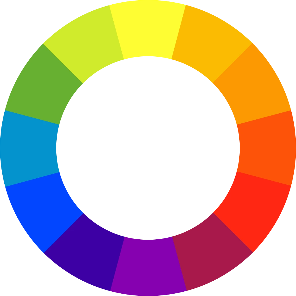
First, we have the primary colours, which are red, blue, and yellow. These are the foundational building blocks of the entire colour spectrum. They cannot be created by mixing any other colours together. Every other shade in your yarn stash is ultimately derived from some combination of these three bases.
Second, we have the secondary colours, which are green, orange, and purple. These are created by mixing equal parts of two primary colours. Mixing blue and yellow yields green, mixing red and yellow yields orange, and mixing red and blue yields purple.
Finally, we have the tertiary colours. These are the beautiful, nuanced shades created by mixing a primary colour with an adjacent secondary colour. Examples include yellow-green, blue-purple, and red-orange, etc. When you look at a highly sophisticated skein of tonal yarn, you are often looking at a rich tertiary colour.
Warm and Cool Tones
Once you understand the basic wheel, you can divide it in half to understand colour temperature. One side of the wheel contains warm colours, which include reds, oranges, and yellows. The other side contains cool colours, which include blues, greens, and purples.
Temperature plays a massive psychological role in how we perceive a crocheted or knitted garment. Warm colours are energetic, vibrant, and visually advancing. This means that if you crochet a bright red sweater, the colour will draw the eye immediately and make the garment appear slightly closer and more prominent. Warm colours are fantastic for bold statement pieces, vibrant children's clothing, and cheerful home decor items meant to brighten up a dreary room.
Cool colours, on the other hand, are receding, calming, and soothing. A soft blue or a gentle sage green will visually pull back, creating a sense of tranquility. Cool tones are exceptionally popular for large, cozy afghans, relaxing shawls, and garments that are meant to be sophisticated and understated. Understanding the temperature of your yarn can help you dictate the overall mood and energy of your finished project.
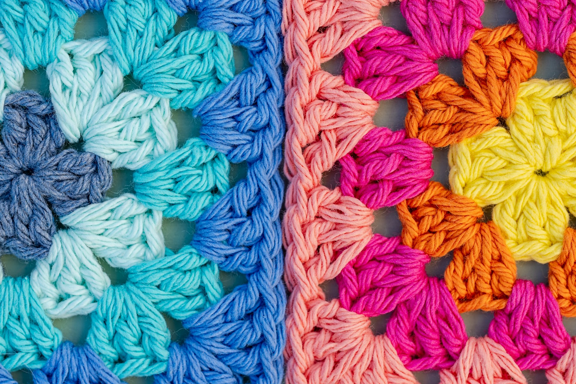
This image is a great example of cool on the left and warm on the right!
Proven Colour Harmonies
You do not need to rely on guesswork to find colours that look good together. Artists have been using established colour harmonies for centuries to create visually pleasing palettes. Here are the most useful harmonies to apply to your next project.
The Monochromatic Palette
A monochromatic palette uses only one single base colour, but incorporates various tints, shades, and tones of that colour. A tint is the base colour mixed with white, a shade is the base colour mixed with black, and a tone is the base colour mixed with gray. For example, a monochromatic blue blanket might feature stripes of pale baby blue, medium denim blue, and deep navy blue. This harmony is incredibly safe, highly sophisticated, and virtually impossible to mess up. It allows the texture of your stitches to shine brilliantly without the distraction of competing hues.
The Analogous Palette
Analogous colours are any three colours that sit directly next to each other on the colour wheel. Think of blue, blue-green, and green, or red, red-orange, and orange. Because these colours share common foundational pigments, they blend together beautifully and create a sense of natural harmony. Analogous palettes are the absolute best choice when you want to create a faded garment. Fading is a popular technique in both knitting and crochet where you slowly transition from one colour to another. Using analogous colours ensures that the overlapping sections blend seamlessly without creating muddy, unappealing stripes.
The Complementary Palette
Complementary colours sit directly across from one another on the colour wheel. The classic pairs are red and green, blue and orange, and yellow and purple. When placed side by side, complementary colours create maximum visual tension and high contrast. They make each other appear brighter and more intense. This harmony is not for the faint of heart, but it is incredibly effective for specific projects. If you are working on a piece of intricate mosaic crochet, a striking geometric blanket, or a sharp two-colour Fair Isle knitting pattern, a complementary palette will ensure your pattern stands out with crisp, undeniable clarity.
The Triadic Palette
A triadic palette uses three colours that are evenly spaced around the colour wheel, forming a perfect triangle. The primary colours (red, blue, and yellow) are a perfect example of a triadic palette. This harmony is vibrant, playful, and highly energetic. Triadic palettes are exceptionally popular for crocheting colourful granny square blankets or crafting bright amigurumi toys. To prevent a triadic palette from feeling completely overwhelming, we recommend letting one colour serve as the dominant base, while using the other two strictly as accent colours.
The Secret Weapon: Value and Contrast
While choosing the right hues is important, understanding value is arguably the most critical skill a fiber artist can develop. Value refers to the relative lightness or darkness of a colour. Two yarns can have completely different hues, such as a medium green and a medium red, but possess the exact same value.
If you are planning a project that requires two or more colours to stand out against one another, such as a striped scarf or a colourwork yoke sweater, you must ensure your yarns have different values. If you pair a medium green yarn with a medium red yarn, the colours will vibrate uncomfortably against each other and the pattern will dissolve into visual mush from a distance. You need a light yarn paired with a dark yarn to make the design pop.
You can use the camera on your phone to test the value of the yarn you've chosen. Take a photograph of the yarns, and then apply a completely black and white (also known as grayscale!) filter to the image. By removing the colour, you are left looking only at the value. If the skeins look like the exact same shade of gray in the photograph, they do not have enough contrast to work together in a colourwork pattern. You will need to swap one skein out for a significantly lighter or darker option. This simple technological trick has saved countless crafters from hours of frustration and unravelling.
Navigating Hand-Dyed and Complex Yarns
The rise of independent yarn dyers has blessed the crafting community with an incredible array of complex yarns. While these skeins are undeniable works of art by themselves, they require careful consideration when planning a project.
Variegated yarns feature multiple different colours in the same strand. When working with heavily variegated yarn, you must be aware of pooling. Pooling occurs when the same colour naturally stacks on top of itself in subsequent rows, creating unintended blotches or stripes of colour in your fabric. Sometimes this effect is desired, and you can still create really cool pieces with it. However, if you want a more evenly distributed mixture of colours, you should alternate between two different skeins of the same variegated colourway every two rows. This breaks up the colour repeats and creates a beautifully blended, watercolour effect.
Speckled yarns feature a solid or semi-solid background dotted with sharp, bright flecks of dye. These yarns are incredibly playful, but they can easily obscure intricate stitch patterns. If you are knitting complex intertwining cables or crocheting heavily textured bobbles and popcorn stitches, a speckled yarn will likely camouflage all your hard work. Save your wildly speckled and variegated yarns for simple, smooth stitch patterns like the single crochet or half double crochet. Let the yarn do the heavy lifting while the stitches take a back seat.
When pairing a complex hand-dyed yarn with a solid colour, pull out one of the least dominant colours from the variegated skein to use as your solid base. For example, if you have a skein of yarn that is mostly blue and purple but features tiny splashes of mustard yellow, pairing it with a solid mustard yellow yarn will highlight those subtle splashes and tie the entire project together cohesively.
Blending Colours Through Marling
If you want to create a truly unique fabric, you can bypass the traditional colour wheel entirely and mix your own custom colours directly on your hook or needles. This technique is known as marling. Marling simply involves holding two or more strands of yarn together as you work.
You can hold a strand of solid red fingering weight yarn together with a strand of solid blue fingering weight yarn to create a purple, tweedy worsted weight fabric. This is an absolutely brilliant way to bust through your yarn stash and use up leftover oddballs from previous projects. By constantly swapping out one of the strands while keeping the other consistent, you can create a beautiful, cohesive fade blanket that slowly shifts through the entire rainbow without any harsh stopping or starting points.
Marling is also an excellent way to tone down a colourway that is slightly too bright or wild for your current taste. By holding a brightly variegated skein together with a solid strand of cream, gray, or black, you can mute the intensity of the colours and create a more sophisticated, wearable garment.
Conclusion
Colour theory is a massive subject, but you do not need a degree in fine arts to apply it successfully to your crocheting and knitting. By simply keeping the colour wheel in mind, checking the value of your skeins with a black and white photograph, and respecting the relationship between complex yarns and stitch textures, you will set yourself up for absolute colour success.
The next time you walk into a yarn shop, take a deep breath and look at the shelves through the lens of colour harmonies. Experiment with an analogous fade, or bravely attempt a high contrast complementary colourwork project. The Cozy Stitches Guild encourages you to play, make mistakes, and discover the palettes that speak most deeply to your own personal style.
Thank you for spending a portion of your Monday with us. We hope this guide brings a renewed sense of confidence to your creative endeavors. Have a wonderful, colourful week, and keep stitching with joy. We will be right back here next week with more tips, tricks, and inspiration to fuel your crafting journey.